11 versatile website layout ideas for every page type
Every day, we interact with countless website layouts, often without giving much thought to what makes them effective. Unless you’re a designer or actively building a website, you might not stop to consider what goes into crafting a great webpage structure.
You might recognize a poor layout when you see one—it’s frustrating, confusing, or unappealing. But do you know how to design a layout that captivates your visitors while helping you achieve your site’s goals?
If you’re unsure, don’t worry. We’ve got you covered. In this guide, we’ll explore examples of various website layout styles, explain when to use each type, and show you how to pick the right layout for your site’s purpose. Plus, we’ll share tips and tools to help you create your own layout mockups with confidence.
11 Common Types of Website Layouts
To inspire with ideas for website layouts, let’s explore some common types, the kind of websites they work best for, and examples of each. Keep in mind that these categories are not rigid—many websites successfully combine multiple layout principles to create a unique and effective design.
1. Z-pattern
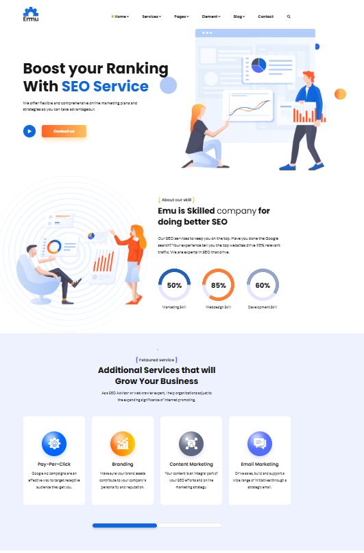
The Z-pattern layout leverages the natural way many users scan a webpage. Typically, the eye starts at the top-left corner, moves across to the top-right, then diagonally down to the bottom-left, and finally across to the bottom-right. This pattern is ideal for guiding users through content in a logical and engaging way.
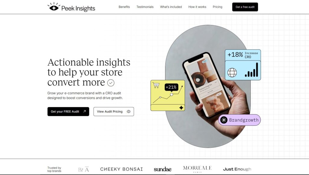
You can leverage this natural scanning behavior by positioning key elements strategically. Place your logo in the upper-left corner and align the navigation menu to the upper-right. The most critical information, like your headline and visuals, can sit diagonally down to the left, with a call-to-action placed to the right of it.
This layout is highly skimmable and works best for websites with minimal content where key elements, such as CTAs, forms, and buttons, demand attention.
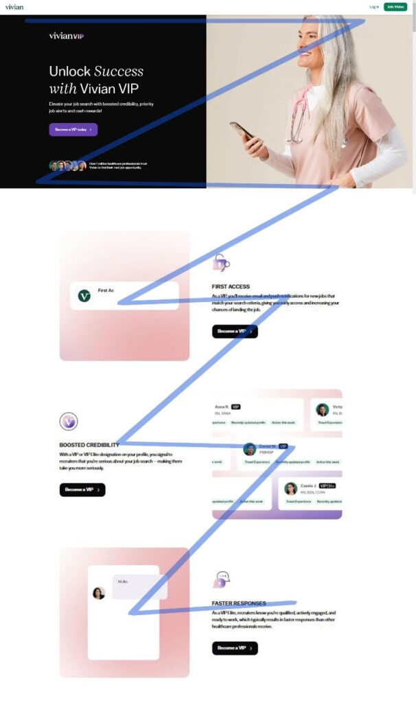
For a more engaging experience, you can stack multiple Z-patterns with alternating elements, creating a zigzag flow that keeps visitors scrolling and focused on the content.
2. F-pattern
This layout is inspired by typical page-scanning behavior, first identified and studied by the Nielsen Norman Group.
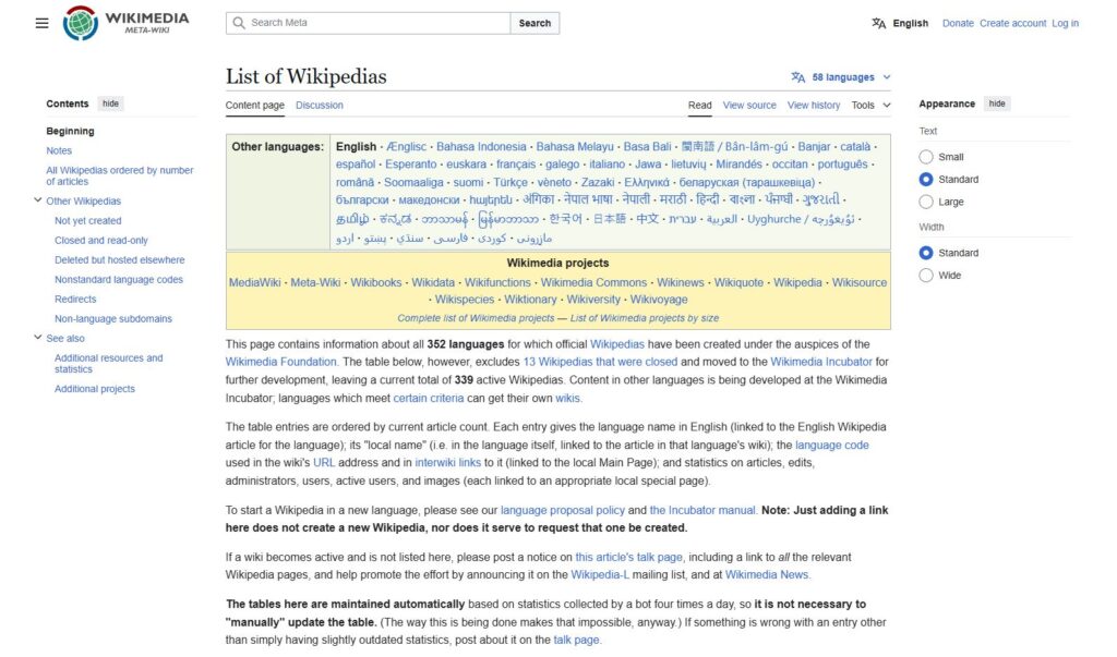
This layout is evident on both desktop and mobile devices, particularly for text-heavy websites. It’s ideal for pages with extensive options or written content that users need to scan quickly, such as news platforms or search results. To maximize its effectiveness, the left side can be used as a visual anchor to guide the user’s focus.
It’s worth noting that while the F-pattern reflects natural reading behavior, the Nielsen Norman Group has recently emphasized that it may not always benefit users or websites. Instead, they recommend using formatting techniques such as bullet points, icons, and images to guide readers and encourage deeper engagement with the content.
3. Magazine
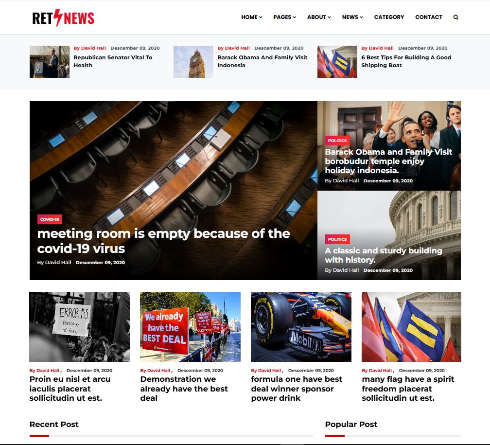
Magazine layouts draw inspiration from traditional newspapers and magazines, offering a visually rich and structured design. These layouts typically feature multiple columns with individual content blocks, creating a dynamic and organized visual hierarchy. Many websites use this style to present diverse content effectively.
The magazine layout assigns varying visual weights to different elements to highlight their relative importance. Larger headlines, bold typography, or striking images are often used to establish a multi-level hierarchy.
The design aims to help users quickly scan through a large amount of information, making it an excellent choice for content-rich websites that cover diverse topics. It’s also ideal for dashboards in web applications. Themes like “Gazette” showcase how effectively a magazine-style layout can be implemented.
4. Grid
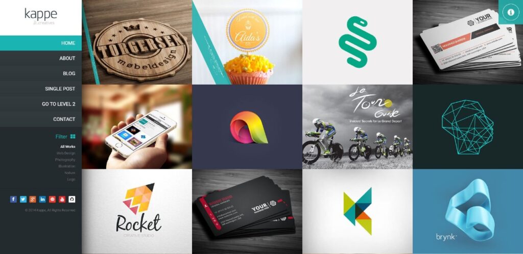
Also known as box-style layouts, grid-based designs organize content across the page using a structured and consistent framework.
The result is a clean, well-organized design with a geometric arrangement. This layout works particularly well for websites with multiple pieces of content that hold equal importance, such as portfolios. Linked content is often displayed as an image paired with a title and a brief description.
For content with varying levels of importance, you can easily adjust the design by emphasizing specific elements through size, color, or placement.
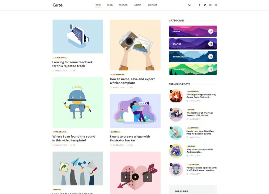
5. Modular
Another popular option in website layout design is the block-style grid, often referred to as a card layout. In this structure, each piece of content is housed in its own neatly defined space, evenly distributed across the page for easy navigation. This layout is widely recognized from platforms like Pinterest and similar sites that rely on visually appealing, card-based designs.
This layout is highly adaptable for mobile design, as it adjusts seamlessly to smaller screen sizes. It’s particularly well-suited for business websites, product listings, or showcasing custom post types, where clear, organized content presentation is key.
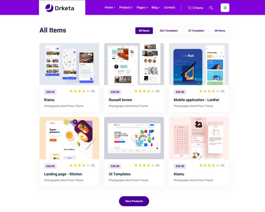
6. Single-Column
Next on our list of website layout examples is the single-column layout, where all content is arranged vertically and displayed in a sequential order.
This layout is particularly user-friendly, especially on mobile devices, where users tend to prefer scrolling over navigating between multiple pages. To enhance usability, consider adding a back-to-top button and a sticky menu for easier navigation.
For content that is primarily text-based, be sure to incorporate images and other visual elements to break up the text and improve readability. This layout is commonly used for blogs, content feeds, and landing pages, where a straightforward, scrollable structure works best.
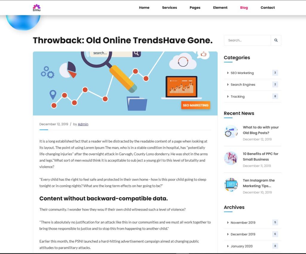
7. Content-Focused
As the name implies, this layout is ideal for websites where the primary focus is on written content. It’s similar to the single-column layout, but with one main column for the content and one or more side columns to display additional information.
While the main content takes center stage, the side columns offer space for elements you want visitors to notice after engaging with the core content. These could include a newsletter sign-up form, product or service ads, or promotional banners.
This layout is especially effective for blogs or websites that center around textual content. However, even on pages of websites with different layouts, this content-focused structure can be a valuable addition.
8. Full-Screen
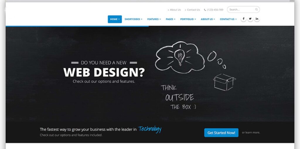
This layout utilizes the full width and height of the screen, with no sidebars, creating a seamless, unified design. Often, it features a modular structure that scrolls through sections, with each part feeling like its own standalone page. A background image or video is commonly used to enhance the visual impact.
Full-screen layouts are particularly effective for one-page websites, storytelling sites, and product showcases. They shine when paired with bold colors or striking visuals to engage visitors. If this layout appeals to you, the Afterlight theme could be an excellent fit.
9. Hero
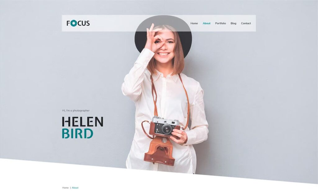
A unique variation of the full-screen layout, this design features a large image at the top, often referred to as a “hero image.” This striking visual serves as the backdrop for key elements such as the site title, call-to-action buttons, and other important information.
Hero layouts are an effective way to immediately grab attention and clearly communicate the main focus of the page, particularly for products. The large, bold image makes a strong visual impact, while text elements provide essential details.
This layout is especially well-suited for product pages and e-commerce sites. However, it’s also used by some blogs to make a dynamic first impression.
11. Asymmetrical
This layout is similar to the split screen or grid design but features an uneven distribution of elements, creating a more dynamic and visually interesting structure. The asymmetry adds energy to the page while still maintaining a sense of order, making it ideal for websites that want to stand out and showcase diverse content in a compelling way.
By manipulating elements like scale, color, and width, you can create visual focal points that draw attention to specific areas of the page. Despite the asymmetry, the design maintains an underlying order that ensures elegance and cohesion.
Asymmetrical layouts are great for websites aiming for a modern, innovative feel, guiding users’ attention in dynamic ways. Ideal candidates include business sites, online portfolios, and landing pages, where a bold, creative structure can leave a lasting impression.
10. Split-Screen
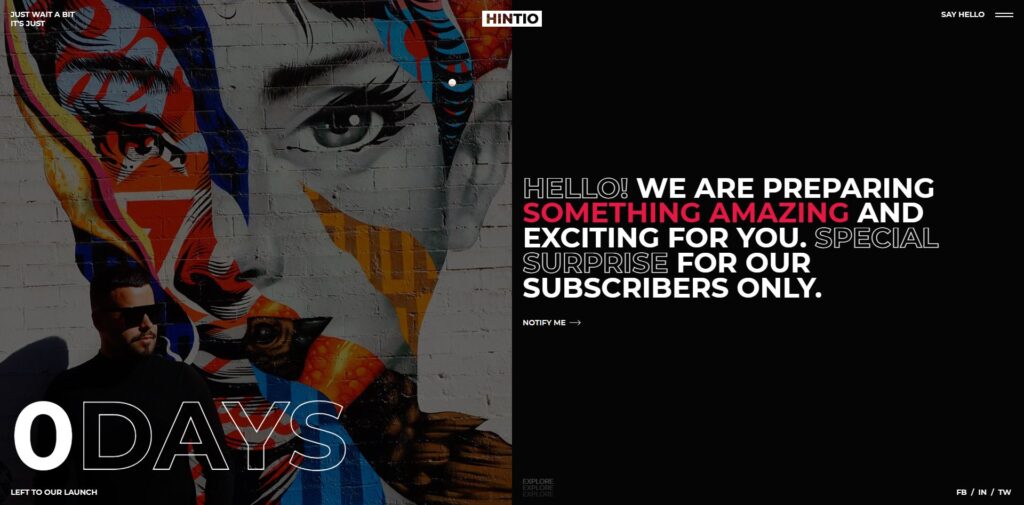
In this layout, the screen is split into two equal sections, often with contrasting content on each side.
Split-screen layouts offer a balanced and symmetrical design, allowing you to present two distinct ideas or aspects equally. This layout can also be used to showcase the same concept from different perspectives or to guide e-commerce customers down separate paths from the outset.
This approach works particularly well for websites featuring two types of content, such as images and text, or for those offering two separate user journeys. It’s also an excellent choice for sites aiming for a modern, clean aesthetic. However, it may not be ideal for text-heavy designs, as it doesn’t scale well, particularly on mobile devices.
How to Choose a Website Layout
Now that you’re familiar with different types of website layouts, how do you choose the right one for your site? Here are a few practical tips to help you make that decision.
Distinguishing Between Website Layout and Structure
First, it’s important to understand that a website layout is the arrangement of elements (like content, navigation, header, and footer) on each individual page. It focuses on how information is presented and how users interact with it on a specific page.
On the other hand, website structure refers to the overall organization of your site and how different pages are interconnected. While layout deals with how a single page is organized, structure looks at the bigger picture, guiding users through different sections of your site.
You can have different layouts for each page based on its purpose. For instance, the layout for a blog post might differ from a product page or a contact page. However, the structure of the site, including elements like the header and footer, tends to remain consistent across pages.
This ensures a cohesive user experience across your site, while still providing the flexibility to tailor the presentation of various types of content to suit different needs.
What Is the Goal of Your Website Layout?
A well-designed layout can significantly boost user engagement and encourage visitors to stay on your site longer. In contrast, a poor layout can cause users to leave almost immediately. With many visitors deciding within seconds whether to stay or go, it’s essential to have an effective layout. Here’s what a great website layout can achieve:
Creates a Positive First Impression – Visitors make judgments about your site within the first few moments. A clean, well-organized layout can immediately capture their attention.
Guides the Eye to Key Content – The layout should naturally direct users to the most important content, whether it’s products, services, or informational sections. A good structure makes sure users can easily find what they need.
Enhances User Experience (UX) – A strong layout improves navigation, helping users quickly find what they’re looking for both on individual pages and across the site. It establishes clear relationships between elements, ensuring the content flows logically and intuitively.
Offers Direction – The layout guides users, placing vital information at the top and leading them through the page toward your desired outcome, whether it’s making a purchase or signing up for a newsletter.
Ultimately, the best layouts are so seamless that users don’t notice them—they can effortlessly navigate and find everything they need. A layout designed with your target audience in mind, based on their preferences and behavior, is the key to making the most impact.
Consider the Type of Website You Are Building
As highlighted earlier, different website layouts are better suited for different types of websites. To select the most appropriate layout for your site, it’s essential to first define the purpose and goals of your website.
Whether you’re creating a business website, an online store, or a blog, each type of site has unique priorities and needs that will influence the layout. Understanding the specific focus of your website will help you choose a layout that best supports its objectives.
This clarity will guide your decisions and ensure that the design aligns with the needs of your users and the nature of your content.
Do Your Research
Your website doesn’t operate in isolation. It’s helpful to examine websites within your category (e.g., blog, ecommerce, B2B, B2C, etc.), especially those in different industries or offering different products/services.
By analyzing these sites, you can identify common layout patterns, design trends, and best practices that work well. Take note of what appeals to users and what seems to enhance user experience. This approach allows you to identify opportunities to improve your own layout and differentiate your website in a way that stands out while maintaining effectiveness.
Consider What You Like
While a website is designed to meet the needs of your audience, it should also reflect your personal preferences. If you’re not satisfied with the way your own site looks or feels, it’s unlikely that you’ll be motivated to invest the time and effort required to maintain and grow it.
As you decide on a website layout, take a moment to think about what resonates with you. Consider the aesthetics, structure, and overall design that appeal to you, and envision how they can align with your brand. Creating a website you enjoy is key to staying engaged and passionate about its success.
Base Your Design on Common Layouts
The website layouts we’ve covered are widely recognized because they are tried and tested. They have stood the test of time, ensuring that they are user-friendly, intuitive, and easy for visitors to navigate. Opting for one of these proven layouts is a smart choice, as it provides a solid foundation. From there, you can infuse your own unique style, creativity, and branding to make the layout truly yours while still maintaining its effectiveness.
Creating a website layout mockup

WordPress themes offer a lot of flexibility and can easily accommodate various page layouts. However, if you’re building a custom theme or collaborating with a web developer, creating a wireframe can be an essential step. A wireframe serves as a visual blueprint for your page layout, helping you organize and structure the content before diving into the design process. It’s a great tool for brainstorming and refining ideas, ensuring that the final product aligns with your vision and user experience goals.
Wireframing your layout
A wireframe acts as a skeletal framework for your webpage, outlining its basic structure and layout without the detailed design elements. Think of it as a blueprint, helping you visualize where each element will go, such as text blocks, images, navigation, and buttons. While it doesn’t include final colors, fonts, or styling, it provides a clear guide for how the page will function and how users will interact with it.
Here’s how to build a basic wireframe for your website layout:
Define the User Journey – Consider your layout goals: where do you want to direct your visitors? What actions do you want them to take? Think about the experience you’re designing and how to guide users to accomplish those tasks.
Start with Simple Sketches (Mobile First) – Wireframes don’t need to be polished, so start by sketching ideas quickly. It’s often helpful to begin with mobile views and then expand to larger screens. This approach ensures your design is responsive and prioritizes essential elements.
Create the Basic Structure – Look at the page from a top-down perspective. Focus on placement of key elements like the header, footer, and navigation. Make sure your layout is intuitive and easy to navigate.
Allocate Content Areas – Define the locations for different content pieces, such as headlines, text, images, and videos. It’s important to know what kind of content you’ll use (e.g., the amount of text and size of images) to properly allocate space in your wireframe.
Refine and Iterate – Once you’ve built your initial wireframe, don’t settle immediately. Refine it through several iterations to explore different ideas. A well-thought-out design takes time, and the best solutions often emerge through trial and error.
User Testing – Share your wireframe with potential users for feedback. Real-world input is invaluable in optimizing the layout and usability. Tools like Figma or Adobe XD allow for easy testing and revisions.
Repeat the Process – Continue refining your wireframe based on user feedback and additional thoughts. Keep testing and revising until you’re confident that your wireframe is the best representation of your ideas before moving into the design phase.
Pro Tip: WordPress.com offers wireframe block patterns for users who want a quick start. These patterns are simple and functional, designed as blank canvases that you can customize to create your layout. Check the patterns library and choose the one that best fits your needs before diving deeper into design.
Here are some additional tips to enhance your website layout:
Establish a Clear Visual Hierarchy – Identify your most important content and structure your layout to draw attention to those elements. Use size, color, and placement to guide the user’s eye to key areas, making them easy to spot and interact with.
Implement a Grid System – Grids are essential in web design as they bring structure and consistency to the layout. They serve as a foundation, helping to align content in a way that looks organized and visually appealing, whether it’s text, images, or buttons.
Follow the Rule of Odds – When grouping design elements like images or icons, it’s better to use an odd number (e.g., 3, 5, or 7). Odd numbers are more dynamic and make the layout feel more balanced, drawing attention to a single focal point rather than splitting it between two items.
Prioritize Scanability – Users typically scan rather than read entire pages. To make your layout scan-friendly, break up text into smaller chunks, use subheadings, bullet points, and images. Make sure key points are easy to find quickly.
Optimize for Above-the-Fold Content – The first part of your website visible when someone lands on your page is crucial. This “above-the-fold” area should contain your most important content and call-to-action buttons so visitors can immediately understand your website’s purpose and take action.
Use Ample White Space – Don’t crowd your page with too much content. White space, or negative space, is essential for a clean and uncluttered design. It gives elements room to breathe, improves readability, and helps emphasize key content without overwhelming the visitor.
By keeping these tips in mind, you can create a layout that is both functional and aesthetically pleasing, offering users an intuitive and enjoyable experience on your website.
Tools for Wireframing
Here are some tools you can use to create wireframes for your website:
Pen and Paper – The classic method is still one of the fastest and most effective. Sketching your ideas on paper allows for quick iterations and doesn’t require learning any new software. Great for brainstorming and visualizing your layout.
Whimsical – A user-friendly collaborative tool designed for wireframing and gathering feedback. Whimsical’s simple interface makes it easy to use, and the free plan offers plenty of functionality for wireframe creation and collaboration.
Invision – Similar to Whimsical, Invision enables collaborative design. It provides wireframe templates and allows for easy sharing and feedback gathering. Their free plan includes up to three online whiteboards, which is great for small projects.
Figma – A widely used design tool for both wireframing and prototyping. Figma offers free wireframe kits, making it easy to get started with your website layout. It’s a powerful tool for real-time collaboration, and the free plan is great for individual use.
WordPress.com Wireframe Patterns – If you want a simpler approach, WordPress.com offers pre-designed wireframe templates, which you can adjust to fit your needs. These patterns serve as a quick starting point without having to create a layout from scratch.
These tools cater to various skill levels and project needs, allowing you to create wireframes efficiently and effectively. Whether you prefer a hands-on approach or a more structured digital tool, you can find a solution that works for you.
Find the Right Website Layout for Your WordPress Site
The layout plays a crucial role in determining the user experience of your website, making it a critical element to get right. When designing your site, give ample attention to how the layout is structured to ensure it serves your visitors effectively.
Starting with established layout structures can save time and effort, as these have been tested and refined to meet user expectations. While it’s important to add your unique style, you don’t need to reinvent the wheel. Additionally, using different layouts for various pages can enhance the overall experience and better cater to specific content or goals.
When selecting the best layout for your site, keep your website type, goals, industry, and personal preferences in mind. Wireframing is an excellent way to conceptualize your layout ideas and ensure they align with your vision. Ultimately, the most effective layouts are those that users can navigate intuitively, often without even noticing the design.
For a streamlined development process, consider tools like Studio, which allows you to quickly build and develop locally with WordPress. It’s a fast, free way to get your site up and running—get started today.
